 Miguel Escobar Published September 9, 2019
For the better part of 2019, the focus of this blog has been Data Preparation articles for Power BI / Power Query.
Usually, the average data analyst spends most of his / her time on this task – making sure that the data is in the shape / form that the computer requires it to be to later perform analysis and create reports / dashboards.
That final phase, the report / dashboard, is what it’s called the Data Visualization layer. This will be the new focus of this blog for the next few months.
This first blog post series that I wanted to have is more of a retrospective or exploration of how each and every one of us is consuming data visualization on a daily basis in contrasts to how it was 20 years ago, and how we’re getting trained to interpret data visualizations from our early days and in our day to day basis.
I’ll be covering some day to day places where we see the effective usage of Data Visualizations. From your Mobile Apps, to your smartwatch, your videogame and even your baseball game.
At the end of the series, I’ll gather the best of all of these and create a report using each of the best elements that we find throughout these blog posts. All of it done with the help Power BI.
Understanding and consuming Data Visualizations from your early years
It shouldn’t come as a surprise that millennials and the generations that proceed it are pretty used to seeing Data Visualizations in their day to day from their early days.
I was born in 1990 and I have a brother who’s a few years older than me. We used to have the Sega Genesis and the first videogame that I played with him was Super Street Fighter 2:
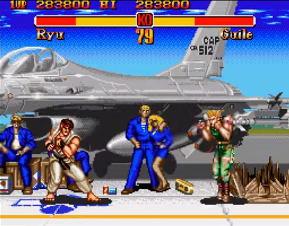
He would beat me every time. (until I figured out how to spam the hadouken)
The main data visualization component that you see in there is the health bar and how it has a contrast of available vs depleted health.
- The yellow part of the bar shows you the available health that you have left
- The red part of the bar shows you the depleted health bar
You’ll notice that the bar is on the same vertical axis for both characters, but one is on the right (for Guile) and the other one on the left (for Ryu).
Funny thing is, this is not the first iteration of the UI for the Street Fighter series. The original UI had these bars in different vertical axis one on top of the other for easy comparison:
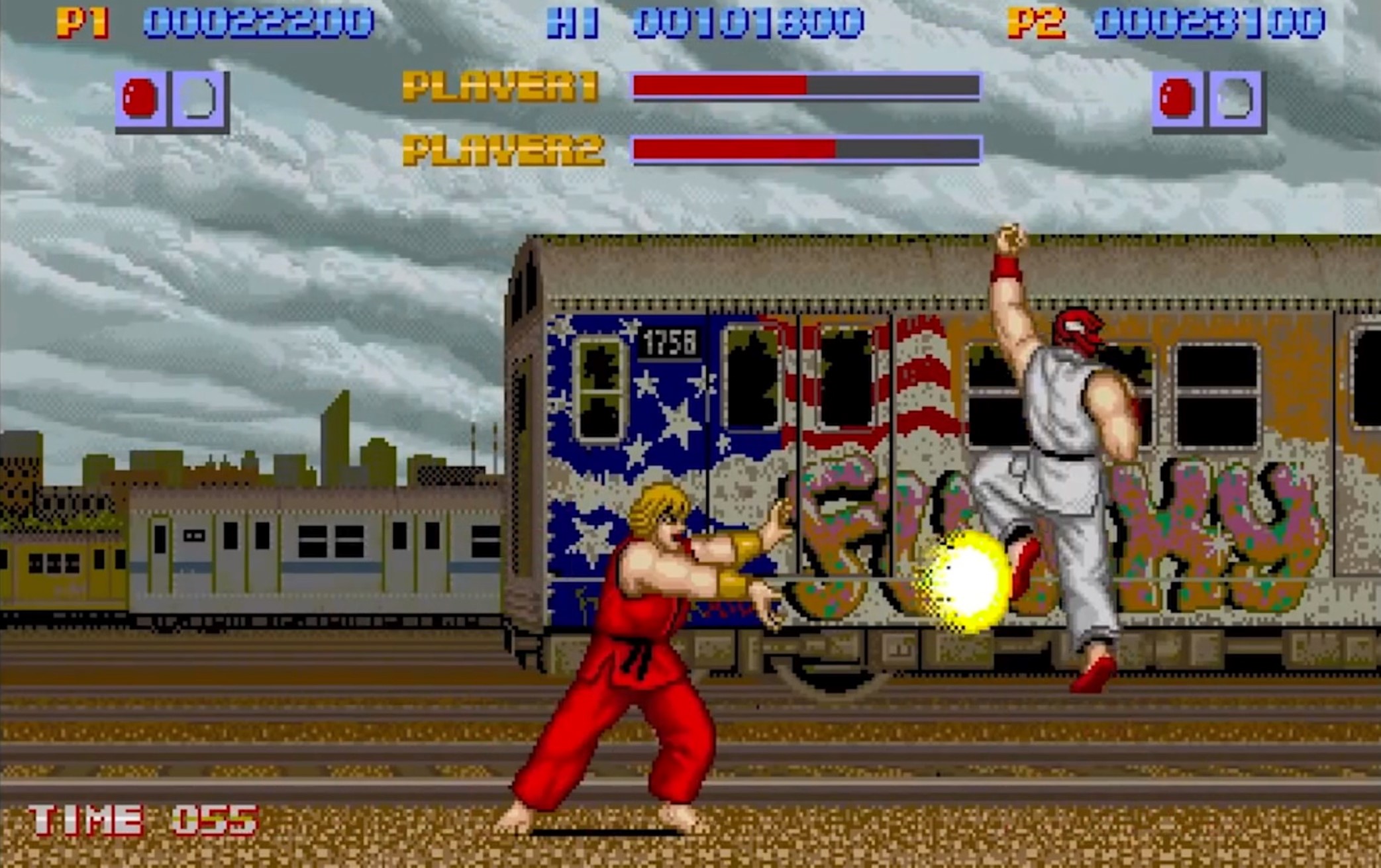
But the game developers decided that a Tornado chart was better for this case and it was widely accepted by most players in that era.
Nowadays, if you have kid, you’ll probably see him / her playing with a game in your phone, tablet, console, etc and you can bet that the game has some data visualizations elements right in there, that your kid is able to interpret and make decisions based on those right there and then.
These are just some examples of how things have been changing throughout the years and the impact that it’s having in our workforce, who might be more used to consuming data visualizations elements.
This is not to say that people who were born before the 80s didn’t have any early encounters with Data Visualizations in their day to day, it’s more to say that the dynamic and interactive aspect of it was mainly “tangible” once videogames arrived for youngsters ranging from the 6 – 18 years of age.
Modern usage of Data Visualizations on Videogames
I rarely have time to play any videogames anymore, but the few videogames that I used to play were more on the FPS (First Person Shooter) genre like Counter Strike and the last game that I played was Destiny 2.
I want to take your attention into Destiny 2 which is developed by Bungie – the same studio that created Halo and that work closely with Microsoft until a few years ago.
You see, in FPS games there’s usually a lot of attention to detail when it comes to statistics of your character, level, weapons, armor and so much more. People go crazy creating their own spreadsheets and experiments on “what’s the damage drop-off for this gun” and such.
I’ve taken the time to re-create in Power BI one of the most important screens in the Destiny 2 game – the weapon screen. Check it out:
It is interactive. Click on any of the icons of the guns in the slicer at the bottom left of the screen and you’ll be able to change the whole report.
This is a report that is consumed by thousands of people on a daily basis.
You might think that creating a screen for a videogame and for a business report is a 180-degree turn, but that’s not true. The reality is that all of these are designs and in graphic design you have some core guidelines that you need to follow, which are similar to the protocols that we have in language: you need to know the message that you’re trying to rely or convey through the report.
Core data visualization elements or messages from our report
We have 4 core elements in that report:
-
Weapon General Info
- Name
- Description
- Picture of the gun
-
Weapon Stats
- Impact, range and other stats shown in a bar chart
- Rounds per minute
- Total ammo capacity
-
Weapon Perks
- Currently shown as just images
One other important element of this is the medium. This report was designed to interact with the controller inputs of something like a PS4 or xbox 1 controller. The report that you see on top might not have those type of animations, hover effects or flashy elements because Power BI wasn’t designed for that type of use case as it usually creates distraction.
Similar to how we saw from Street Fighter 2, a common chart that we see is a bar chart, but in this case is for the stats of our weapon:
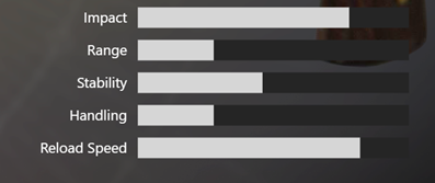
Notice how there’s 2 colors in that chart. One that displays the actual value (the light grey) and another one to display the rest of the “unfilled” bar (with dark grey). In Power BI you can have this effect using stacked bar chart as the message that you’re trying to convey here is the relativity of your actual value against the maximum value (or 100%).
This is one of the most common data visualizations that you’ll see in videogames and probably one of the ones that I’d love to see more businesses using.
Caveats of the report and why you don’t see some elements in Power BI Reports
In an effort to make this report as flashy and visually appealing as possible with all of the images and interactivity, you’ll notice that we have 3 major drawbacks that hinder the main message:
- Real estate of the images takes close to 50% of the report – only close to 50% of the whole report provides key information
- Loading images is pretty slow – you might’ve noticed that this webpage loaded quite fast, but the report embedded above might’ve taken a few seconds to load and the images might not appear immediately. That’s not something unique to Power BI – the actual user interface in Destiny 1 had even worst load times, so that’s the main reason why you don’t see that many people using that many images on a Power BI Report, because these images are not hosted within the Power BI report, but they’re rather urls to assets that might be served from a server thousands of miles away from you where latency and timeout might be an issue.
- Background image is distracting –
for our case where we want to draw conclusions out of this report, the background might be too distracting. In the actual game, it has a parallax effect which is pretty cool and that’s where they wanted to go: Bungie wanted to have a cool effect that wouldn’t make a static background look outdated or just plain, but in our case (since we don’t want any dstractions), a plain and simple background would be enough since we’re mainly interested in the message that the report wants to give us.
Despite all of these improvement opportunities, people are able to consume this report and make simple choices on the fly.
Conclusions
There are more examples of how videogames are now providing even more robust, interactive and engaging data visualizations inside their games. Specifically games that are heavy on the loot mechanics and in finding the perfect min-max loadouts.
While I don’t encourage you to base your Power BI Reports on a screen of a videogame, I do encourage you to be on the lookout for more places in your day to day , outside of Power BI, where you see an effective use of Data Visualizations, analyze why it’s effective to you (as the recipient of the message) and see how you can implement something as effective as that in your Power BI Reports.
One thing that is clear whether you are a game developer or an analyst creating a report, is that you need to be open for constructive criticism and feedback of your users.
The Street Fighter series started with a good idea of the bar chart for the characters one on top of the other (for easy comparison), but based on the community feedback, they changed that to be a tornado as it was far more effective for the users.
Let me know in the comments below what data visualization do you see on your day to day that you’d love to use with Power BI.
Be sure to sign up to this blog so you can receive a notification once the next blog post in this series gets published next week.